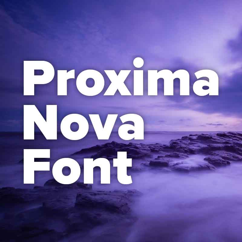
The Proxima Nova font is one of the most widely used and recognizable typefaces in modern design. Created by Mark Simonson in 2005, this geometric sans-serif font bridges the gap between Futura and Akzidenz-Grotesk—offering a perfect mix of functionality, neutrality, and visual elegance. Its clean lines, circular shapes, and humanist touches make it a favorite among designers, developers, and global brands looking for clarity, modernity, and personality in one typeface.
What is Proxima Nova?
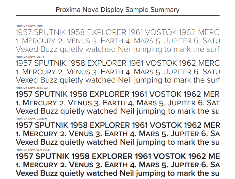
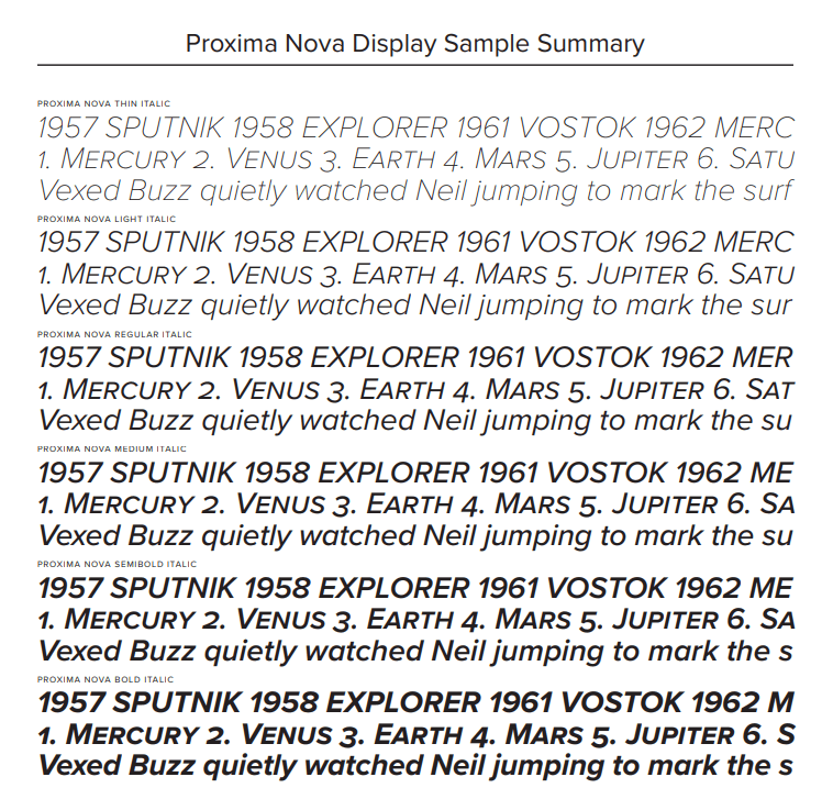
Proxima Nova is a modern sans-serif typeface family that evolved from the earlier “Proxima Sans.” It includes a full range of weights—from Thin to Black—and supports multiple languages and OpenType features. With over 48 styles and extensive character support, it has been widely adopted in branding, digital platforms, editorial layouts, and UI/UX design.
Brands like BuzzFeed, Mashable, NBCNews, and Spotify have used Proxima Nova due to its clean readability, geometric structure, and balanced proportions. Whether you’re building a website, designing an app interface, or creating marketing assets, Proxima Nova brings a professional, contemporary edge to your typography.
Proxima Nova Font Meaning and Design Elements
The Proxima Nova font blends mathematical precision with a humanist softness—offering a clean, trustworthy, and adaptable look. Its visual design includes:
1. Circular Geometry:
The font features rounded letterforms and smooth curves, especially evident in letters like “O,” “a,” and “e,” giving it a friendly yet modern appearance.
2. Balanced Proportions:
Its x-height, character spacing, and line weight are optimized for readability at both large and small sizes—perfect for responsive design.
3. Extensive Style Range:
From ultra-thin to bold and extra-black weights, Proxima Nova works across headings, body text, and navigation elements.
4. Subtle Humanist Influences:
While largely geometric, Proxima Nova includes slight curves and natural adjustments to avoid stiffness, making it warmer than purely mechanical fonts.
Proxima Nova Font Usage and Applications
Due to its versatility, Proxima Nova is a favorite for various design applications:
-
Web Design: Commonly used for website typography because of its legibility and clean appearance across screen sizes.
-
User Interface (UI): Smooth rendering and adaptability make it ideal for mobile apps, dashboards, and digital products.
-
Branding: Offers a strong, neutral foundation for logo design, packaging, and corporate identity.
-
Print Media: Maintains readability and clarity in brochures, magazines, and print ads.
Whether you’re designing for screen or print, Proxima Nova provides the flexibility and consistency professional designers need.
Available Formats of Proxima Nova Font
You can download the Proxima Nova font in multiple popular formats to ensure maximum compatibility across platforms:
-
OTF – Ideal for professional use in Adobe Creative Suite and design tools.
-
TTF – Widely supported on all operating systems and applications.
-
WOFF/WOFF2 – Web-optimized versions for fast, reliable loading in browsers.
-
SVG – Useful for embedding in scalable vector graphics and web design projects.
The Proxima Nova font is a timeless typeface that successfully combines geometric clarity with humanist warmth. Its wide adoption across the web and digital media proves its reliability, while its stylish, balanced design keeps it fresh and appealing. Whether you’re building a modern website, refining a brand, or crafting a print layout, Proxima Nova is a professional-grade font choice available in multiple formats for every creative need.