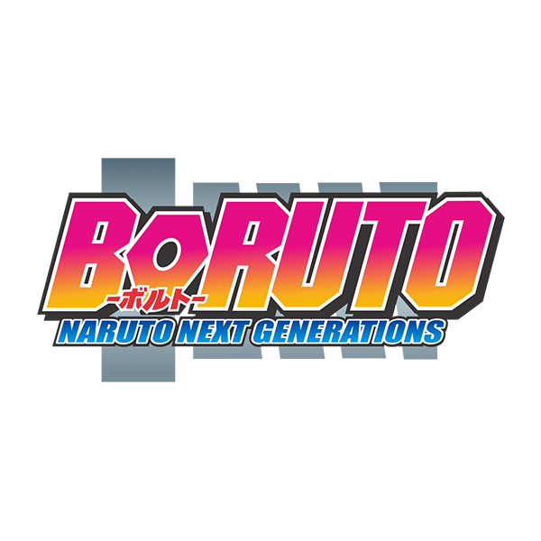
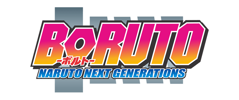
The Boruto Logo represents the next chapter of the legendary Naruto saga. With its vibrant design, bold typography, and futuristic aesthetic, the logo captures the essence of Boruto: Naruto Next Generations — a story about inheritance, evolution, and the journey of a new generation of shinobi. It symbolizes the bridge between Naruto’s legacy and Boruto’s modern world of technology and tradition.
What is Boruto: Naruto Next Generations?
Boruto: Naruto Next Generations is a Japanese anime and manga series created by Masashi Kishimoto, Mikio Ikemoto, and Ukyo Kodachi. It serves as a sequel and continuation of the Naruto series, focusing on Boruto Uzumaki, the son of the Seventh Hokage, Naruto Uzumaki.
Key highlights include:
-
Explores the challenges of living under a legendary father’s shadow.
-
Blends classic ninja traditions with advanced technology and modern themes.
-
Features new generations of shinobi, including Sarada Uchiha, Mitsuki, and Kawaki.
-
Known for its rich storytelling, action, and emotional depth.
The Boruto Logo marks the evolution of the Naruto franchise — modern, energetic, and full of color, reflecting the next phase of the ninja world.
Boruto Logo Meaning and Design Elements
The Boruto Logo combines youthful energy, modernity, and legacy through its design and color palette.
Typography:
-
The word “BORUTO” is displayed in bold, capitalized letters, symbolizing strength and confidence.
-
The lettering style is modern and angular, representing the series’ futuristic ninja world.
-
The smaller text, “Naruto Next Generations,” connects Boruto’s story to his father’s legacy, reinforcing continuity and heritage.
Symbolism:
-
The shuriken and swirl motifs echo the Naruto logo, linking Boruto’s story to the Uzumaki clan’s legacy.
-
The pink and yellow gradient bar behind the title represents energy, youth, and vibrancy — reflecting Boruto’s personality and the colorful new era.
Color Palette:
-
Pink & Yellow Gradient: Symbolize modern energy, individuality, and innovation.
-
Blue & Black Outlines: Represent balance, depth, and the mix of technology and tradition.
-
White Accents: Add clarity and contrast, ensuring readability across backgrounds.
Visual Style:
-
The 3D layered design gives the logo a sense of motion and dynamism, aligning with the series’ fast-paced action.
-
The combination of warm and cool tones bridges the classic Naruto feel with a futuristic aesthetic.
Features and Benefits of the Boruto Logo
-
Modernized Design: Blends tradition and technology to reflect the new generation of ninjas.
-
Symbolic Colors: Represents growth, energy, and Boruto’s vibrant personality.
-
Strong Brand Identity: Continues the visual legacy of the Naruto series with a fresh twist.
-
Global Recognition: Loved by fans for its bold, modern aesthetic and emotional connection.
-
Versatile for Use: Perfect for digital, print, and merchandise design.
Available Formats of the Boruto Logo
The Boruto Logo is available in a variety of professional and editable formats for creative, branding, and promotional use:
-
Boruto Logo PNG – Transparent background; perfect for websites, fan art, and digital overlays.
-
Boruto Logo SVG – Scalable vector format ideal for responsive designs and web layouts.
-
Boruto Logo PDF – Vector format for print materials and documentation.
Usage Scenarios for the Boruto Logo
-
Anime Websites & Blogs: Ideal for reviews, episode breakdowns, and franchise discussions.
-
Fan Art & Merchandise: Perfect for apparel, posters, and collectibles.
-
Social Media: Used in profile banners, edits, and anime-themed posts.
-
Educational & Design Projects: Great for analyzing logo evolution and anime branding trends.
-
Video Content: Suitable for intros, fan edits, and anime-themed YouTube content.
Frequently Asked Questions (FAQs)
Q1: What does the Boruto Logo represent?
A1: It represents the next generation of ninjas — symbolizing Boruto’s individuality, modernity, and connection to Naruto’s legacy.
Q2: Who designed the Boruto Logo?
A2: The logo was created by the anime’s production and design team under Studio Pierrot, maintaining stylistic continuity from Naruto.
Q3: What is the meaning behind the gradient colors?
A3: The pink and yellow tones reflect Boruto’s vibrant energy, youthfulness, and optimism for the future.
Q4: Can I use the Boruto Logo for personal projects?
A4: Yes, for personal or fan projects. Commercial usage requires permission from the copyright holders.
Q5: What file format is best for web use?
A5: PNG and SVG are ideal for web use because they maintain clarity and scalability.
The Boruto Logo is a vibrant evolution of the Naruto franchise’s legacy, symbolizing the balance between tradition and innovation. Its bold typography, bright gradient colors, and modern styling reflect the energy of a new era of shinobi. As the emblem of Boruto: Naruto Next Generations, it perfectly embodies the story’s themes of family, destiny, and progress — making it an iconic symbol for anime fans worldwide.
