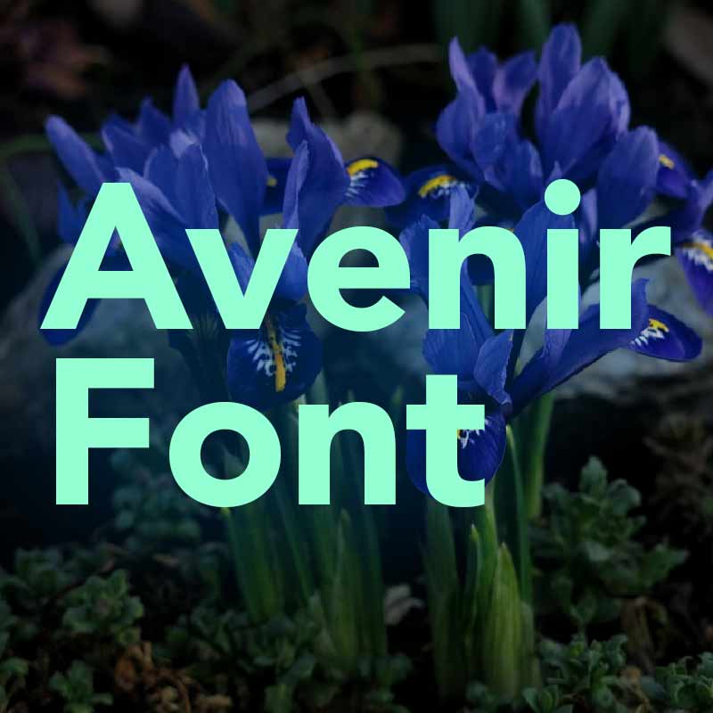
The Avenir font is one of the most respected and enduring geometric sans-serif typefaces in the world of typography. Designed by the legendary Adrian Frutiger in 1988, Avenir—which means “future” in French—was created to offer a modern alternative to classic geometric fonts like Futura. Known for its clean lines, graceful proportions, and exceptional readability, Avenir remains a go-to choice for high-end branding, editorial layouts, digital interfaces, and corporate identity systems.
What is Avenir?
Avenir is a versatile geometric sans-serif font family that bridges classic design and contemporary needs. Unlike rigid geometric fonts, Avenir features subtle variations in stroke width and letterform balance to achieve a more human and natural feel. With a wide range of weights and styles—including Light, Book, Roman, Medium, Heavy, and Black—Avenir supports flexible typographic expression across both digital and print environments.
Avenir has been adopted by some of the world’s leading brands and organizations, including Apple (for early iOS UI elements), Snapchat, and European city signage systems, due to its clear legibility, modern aesthetic, and international compatibility.
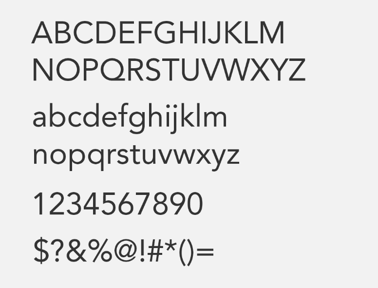
Avenir Font Meaning and Design Elements
The Avenir font combines geometric structure with warmth and balance. Key design elements include:
1. Balanced Geometric Shapes:
Built on geometric principles, especially circles and straight lines, Avenir offers visual consistency while maintaining optical harmony.
2. Humanist Touch:
Subtle modulation in stroke thickness gives the font a natural rhythm and improves on the stiffness seen in older geometric fonts like Futura.
3. Wide Range of Weights:
From ultra-light to bold, Avenir provides flexibility for both headings and body text—ideal for web design, branding, and corporate materials.
4. High Legibility:
Optimized for both print and screen, Avenir ensures clean rendering and easy reading across platforms and sizes.
Avenir Font Usage and Applications
Avenir is a premium typeface widely used by professionals across industries. Its adaptability makes it suitable for:
-
Brand Identity: Frequently used in logos, marketing, and packaging to convey trust, modernism, and sophistication.
-
User Interfaces (UI/UX): Clean and readable, Avenir is a solid choice for mobile apps and web interfaces.
-
Editorial & Print Design: Offers excellent readability in both display and long-form content.
-
Corporate Communications: Common in presentations, reports, and signage for its clarity and professional appeal.
Available Formats of Avenir Font
The Avenir font is available in several professional-grade formats for easy integration into any project:
-
Avenir Font OTF – Ideal for high-end design software like Adobe Illustrator or InDesign.
-
Avenir Font TTF – Compatible with most desktop applications and operating systems.
-
Avenir Font WOFF/WOFF2 – Web-optimized formats ensuring fast, crisp display in all modern browsers.
-
Avenir Font SVG – Scalable format for use in vector designs or responsive interfaces.
The Avenir font is more than just a geometric typeface—it is a symbol of refined modernism and timeless clarity. With its precise design, flexible weights, and elegant letterforms, Avenir has earned its place as one of the most respected fonts in the world of professional design. Whether you’re creating a high-impact brand, a clean web interface, or a printed publication, Avenir offers the confidence and aesthetic excellence your project deserves.
